Posts

Showing posts from September, 2026

Adobe: $4.62 or $6.13 EPS? Read the Reconciliation
Image
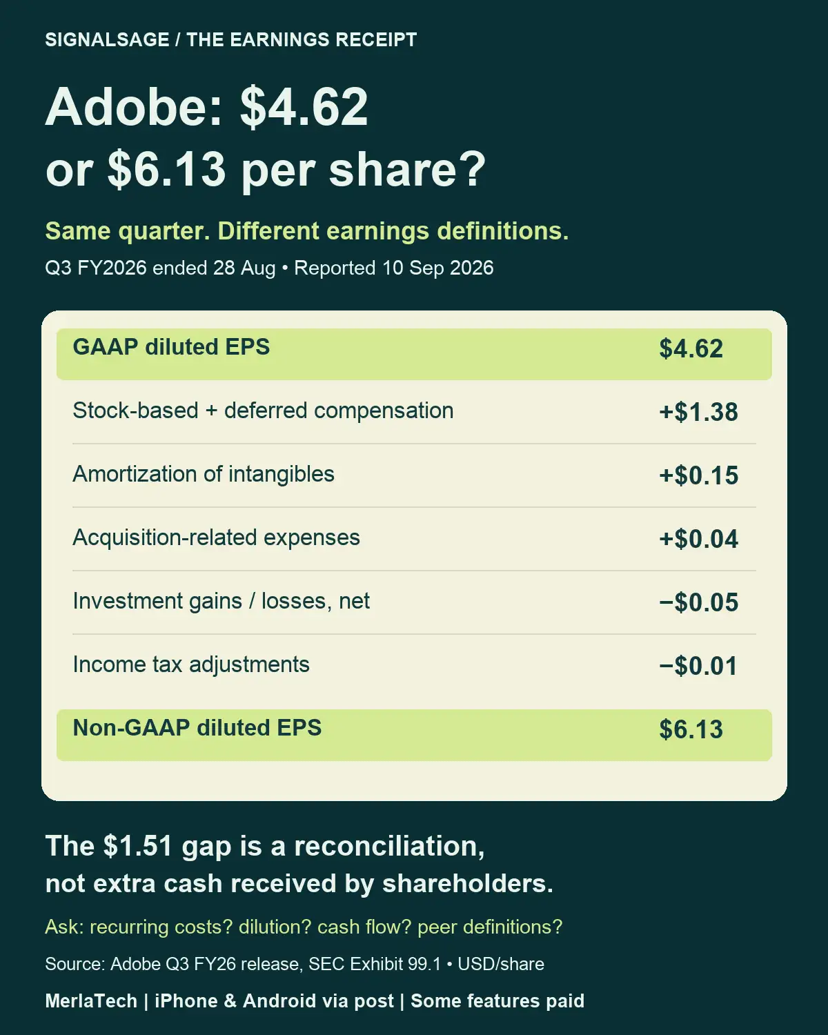
Adobe: $4.62 or $6.13 EPS? Read the Reconciliation Adobe reported Q3 FY2026 diluted EPS of $4.62 under GAAP and $6.13 on its non-GAAP basis. The quarter ended 28 August; the release was dated 10 September 2026. The per-share bridge is $4.62 + $1.38 stock-based/deferred compensation + $0.15 intangible amortization + $0.04 acquisition expenses − $0.05 investment gains/losses − $0.01 tax adjustments = $6.13. Figures are rounded as reported. The $1.51 gap is not extra cash paid to shareholders. Ask which excluded costs recur, how equity compensation affects dilution, what the cash-flow statement shows, and whether peer definitions match. Neither EPS measure alone establishes valuation or future returns. Source: Adobe SEC earnings release, 10 September 2026 SignalSage by the MerlaTech team — US stock research. English UI; some features require in-app purchases/subscriptions. Education, not investment advice. iPhone & Android: iPhone and Android download page Start with a definition befo...
TSMC August Revenue: Why +10.1% and +53.3% Can Both Be Right

Image
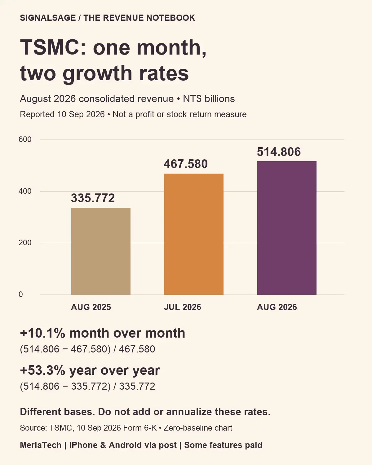
TSMC reported August 2026 consolidated revenue of NT$514.806 billion in its 10 September release. July 2026 was NT$467.580 billion; August 2025 was NT$335.772 billion. These are reported revenue figures, not profit or stock returns. The month-over-month comparison adds NT$47.226 billion: 47.226 / 467.580 = about 10.1%. The year-over-year comparison adds NT$179.034 billion: 179.034 / 335.772 = about 53.3%. Both percentages describe the same August total, using different starting points. Do not add the two rates, subtract them to infer acceleration, or treat one month's growth as an annual forecast. Compare matching periods and currencies, then read margins, cash flow and the business mix separately. Save a three-field research note: reported period, comparison period, currency/unit. A growth percentage without its baseline is an incomplete fact. Start with the unit before doing any arithmetic. The release’s table uses NT$ millions. Dividing every amount by 1,000 produces the NT$...

Samsung + Mistral: When AI Flags a Defect, How Often Is It Right?

Image
Samsung + Mistral: when AI flags a chip defect, how often is it right? Samsung’s 9 September 2026 announcement describes plans to use on-premises AI in semiconductor operations, including defect detection and equipment optimization. It states goals, not a measured yield improvement. Here is our independent, fictional inspection run — NOT Samsung or Mistral performance data. Of 1,000 parts, 20 are defective and 980 are good. A detector catches 90% of defects (18) but also flags 5% of good parts (49). It produces 67 alerts, of which only 18, or 26.9%, correspond to real defects. Two defects are missed; 931 good parts are cleared. The denominator matters: detection rate is 18/20; alert precision is 18/67. Neither alone establishes manufacturing value. A flagged part is not automatically scrapped: review, retesting and process decisions change the economic result. Save three questions for the next factory-AI headline: What is the real defect base rate? How much review and downtime do ...

NVIDIA’s +24% Tokens: Three Gates to Revenue

Image
NVIDIA’s +24% token-throughput case: where is the revenue gate? NVIDIA’s 15 September 2026 post describes Lambda’s DSX MaxLPS test using 19 HGX B200 nodes versus a 16-node baseline within the same power budget. It reports 24% more cluster token throughput. That is a specific company-reported test, not a universal result or a revenue increase. Our separate fictional acceptance test: A generates 1,000,000 tokens and 80% pass a fixed acceptance rule, leaving 800,000 accepted tokens. B generates 1,240,000 and 60% pass that same rule, leaving 744,000. Raw output is 24% higher, while accepted output is 7% lower. These invented acceptance rates are NOT Lambda or NVIDIA measurements. They illustrate why a throughput number alone is insufficient; they do not allege quality deterioration in the reported test. Save three gates before turning an efficiency headline into a stock thesis: 1. Accepted work: same model, quality threshold, latency target and system boundary? 2. Paid demand: how much ...

Microsoft’s AI Sales Case: 20% Higher—Than What?

Image
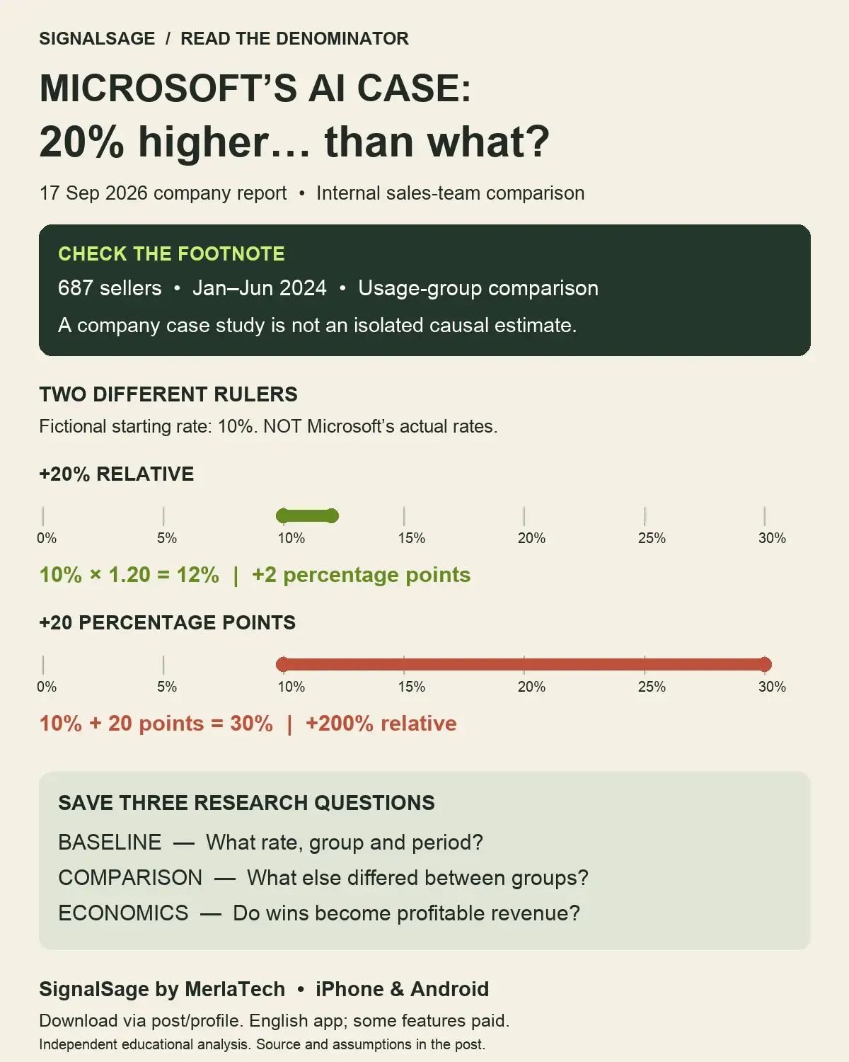
Microsoft’s AI sales case: 20% higher close rates—than what? Microsoft’s 17 September 2026 post reports a sales-team comparison. Its footnote describes internal data on 687 sellers from January–June 2024, comparing regular Copilot users with low-usage sellers. This is a company-reported case, not today’s sales result or an isolated causal estimate of AI’s effect. Our fictional ruler starts at a 10% close rate. A 20% relative increase reaches 12%: a gain of 2 percentage points. Adding 20 percentage points instead reaches 30%, a 200% relative increase. These are teaching examples, NOT Microsoft’s actual rates. Before turning a productivity headline into a stock thesis, save three questions: What is the baseline, population and measurement period? What else differed between the groups? Did additional wins become recognized revenue with attractive margins after software, training and review costs? A useful operational signal still needs a bridge to business economics. Source: https://blogs...

Amazon Leo: More Launch Contracts—What Reaches the Customer?

Image
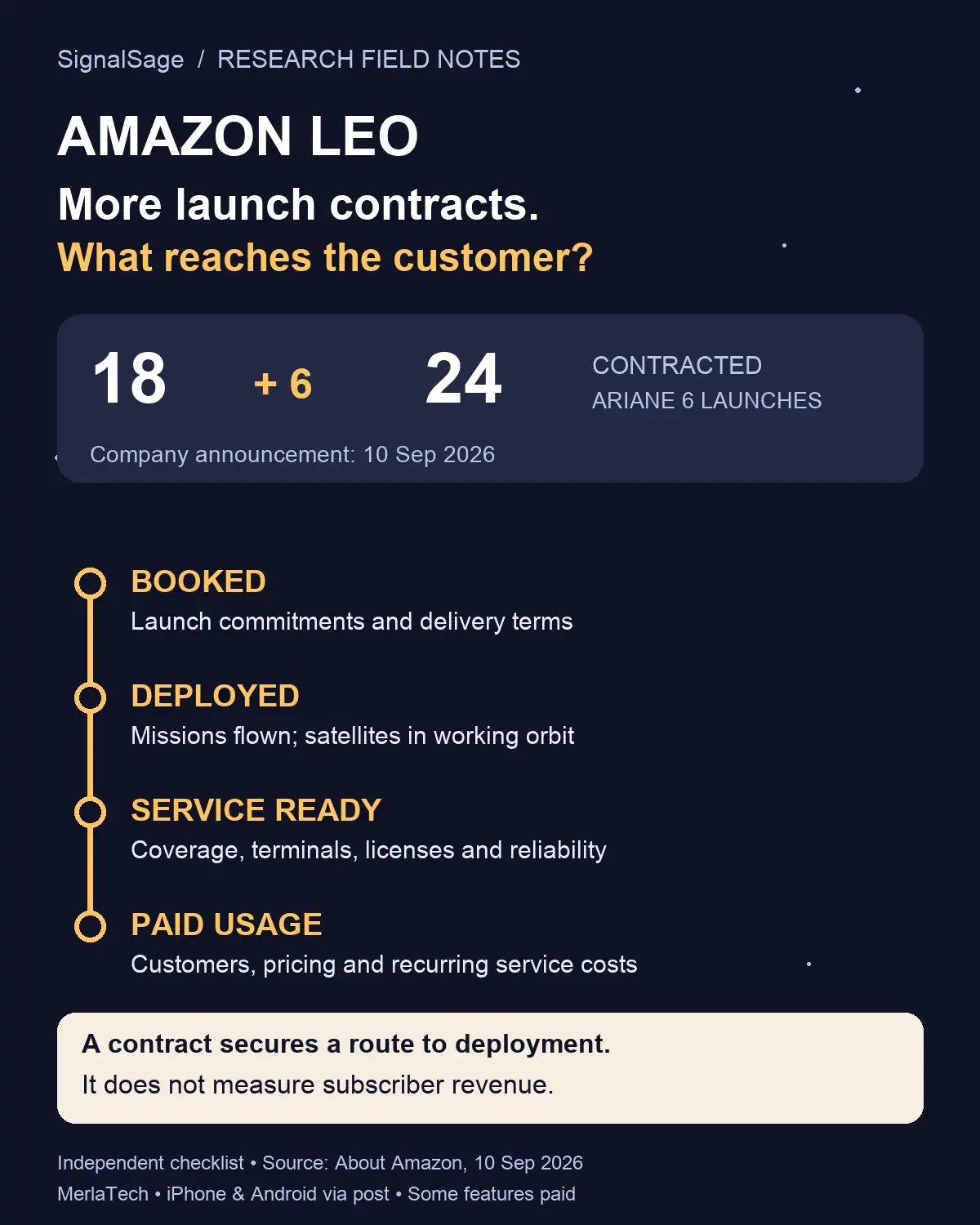
Amazon announced on 10 September 2026 that it was adding six Ariane 6 launch contracts, expanding its Arianespace commitment from 18 to 24 launches. That is a useful fact about contracted capacity. It is not evidence that those six additional missions have already flown, or a measure of subscriber revenue. The announcement is a starting point for a research notebook. To understand the business implications, separate four milestones that are often compressed into a single growth headline: booked, deployed, service ready, and paid usage. 1. Booked: a commitment with conditions A signed launch commitment can secure access to a scarce operational resource. The next questions concern execution: what delivery windows apply, what flexibility exists, and what dependencies could change the schedule? A headline contract count does not disclose all payment terms, cancellation provisions or the allocation of risk between counterparties. Record what the source actually says in one column. Put the u...

Intel + ASML: What Does One Million Wafers Tell Us?

Image
A manufacturing milestone needs a denominator. Intel and ASML’s 7 September 2026 company update says High-NA EUV had processed more than one million wafers across early certification and testing, R&D, and select-layer volume production for a subset of Panther Lake products. This article examines the scope of that statement; it does not independently verify the companies’ results. Schematic research graphic. The wafer grid does not represent the share of testing, R&D or production. What the total can tell you The statement describes accumulated processing activity spanning several purposes. It gives a useful starting point for asking where a technology has been used. Its categories matter: certification work, development work and production work answer different questions. Combining them into one count does not reveal the contribution of each category. Before comparing this figure with another announcement, record the measurement period, system boundary and counting method. Ask...

iPhone 18 Pro Launch: Does Sold Out Prove Demand?

Image
By the SignalSage / MerlaTech team. Apple set 18 September 2026 as the first-market availability date for iPhone 18 Pro and Pro Max. Its 9 September announcement and 12 September preorder date establish a launch calendar, not reported sales. This research note asks what a sold-out label could establish, and what remains unknown. We are not reporting observed Apple stockouts. Two stores, one sign, different scale Imagine Store A receives 20 phones and 30 purchase requests. Store B receives 200 phones and 210 requests. Assume each request is for one phone, there is no replenishment during the observation period, and requests are distinct and valid. Both stores exhaust their inventory. Both also have 10 requests beyond available stock. The fulfilled quantities differ tenfold: 20 versus 200. Requests divided by starting inventory are 1.5 and 1.05. Those ratios describe this invented setup; neither is a company growth rate or a margin estimate. A binary sold-out label discards most of this ...

IBM Quantum: Fewer Errors—What Did It Cost?

Image
A quantum milestone deserves a resource budget beside it. Before turning a laboratory result into a business conclusion, write down the task, the accuracy and what the complete workflow consumed. IBM’s research update dated 15 September 2026 describes a continuum between error mitigation and error correction. Its argument centers on useful computation rather than a logical-qubit count alone. Our graphic is a conceptual reading guide, not measured results. Three resource questions Hardware: How many physical qubits and supporting operations does the demonstrated circuit require? Keep the useful task separate from the machinery needed to protect it. Repetition and runtime: How many runs are needed to estimate the answer at the specified accuracy? A short individual run is not automatically a short complete job. Classical compute and control: What processing happens around the quantum circuit? Record what is included in the reported time and what is excluded. An incomplete boundary m...

MLPerf 6.1: Which AI Chip Wins? Read the Test First

Image
By the SignalSage / MerlaTech team. Which AI chip wins? A headline number cannot answer that until you know what the test measured. MLCommons released MLPerf Inference 6.1 on 16 September 2026, including end-to-end RAG and edge agentic tests. These workloads make the comparison question more specific, not less. Watch the ranking change One fictional example, two different questions Assume the same fictional workload and quality target. System A completes 800 jobs per second using eight devices. System B completes 1,200 using sixteen. B has 50% more total throughput. Divide by device count: A = 800 / 8 = 100 jobs per second per device. B = 1,200 / 16 = 75. A leads on this normalized measure, even though B leads on total output. These numbers are invented for explanation, not MLPerf measurements or a comparison of actual vendors. Neither ranking establishes a cheaper system. Device prices, host equipment, software, electricity, networking and utilization remain unknown. Nor does either r...

Skild’s One-Video Robot Learning: Can the Demo Survive a Full Shift?

Image
By the SignalSage / MerlaTech team. NVIDIA’s report dated 10 September 2026 describes Skild S1 as designed to learn new robot tasks from a video demonstration. That is an interesting development in physical AI. For an investor, the next question is what evidence connects the demonstration to useful, repeatable output. Concept illustration; independent research questions, not a photograph of Skild hardware. 1. Measure the whole job Define a completed task before comparing results. Picking up one component is different from completing an assembly that passes inspection. Ask for repeated trials, the task mix, environmental conditions and the rules for counting failures. A selected demonstration can show capability without establishing reliability over a full shift. 2. Count the human rescues Record interventions, resets and recovery time. Does the robot identify its own failure? Who clears an obstruction or handles an unusual part? A recovery that requires an operator belongs in the opera...

Huawei’s AI Interconnect Push: Which Numbers Deserve an Investor’s Attention?

Image
The striking part of an AI infrastructure announcement is often the largest number. The harder question is what the system actually completes—and under which conditions. Huawei’s 17 September 2026 announcement introduces Atlas 960E SuperPoDs with near-packaged optics, or NPO. It also provides planned 2027 availability for two Ascend 960 variants. The source is Huawei’s own announcement, not an independent benchmark. A roadmap is a statement about intended availability, not evidence of a delivered installation. Start with the workload Peak arithmetic capacity and finished work answer different questions. A useful comparison names the model, numerical precision, batch size and service target. Without those conditions, two impressive throughput numbers may describe different jobs. For inference, ask whether the reported throughput was achieved while meeting the latency target. For training, ask what time period and system boundary are included. Do not combine a component specification wit...

NVIDIA, Google & Emerald AI: Can AI Data Centers Flex With the Grid?

Image
AI expansion has a power-system dimension. On 16 September 2026, Emerald AI, Google and NVIDIA announced the AI Energy Management Alliance, focused on data centers that can adjust electricity use as grid conditions change. Read the official NVIDIA announcement . This is an announced initiative, not proof of a completed facility, a customer order or a particular financial result. The distinction hidden in the headline Power is a rate; energy is an amount over time. Reducing grid draw during a stressed hour does not, by itself, establish that a facility used less energy across the whole day. A job may run later, or a battery may provide electricity while the grid supplies less. The source of energy and its timing matter. Illustrative unit example, not measured company performance: 1 megawatt used for one hour is 1 megawatt-hour. Moving that same work to another hour need not remove the energy requirement. Battery charging also has losses; it does not create free electricity. Read flexib...

Google’s €13B AI Buildout: When Does Spending Become Revenue?

Image
A large AI investment headline is the start of a research question, not the end of one. On 9 September 2026, Google announced €13 billion over two years in Finland across digital infrastructure, clean energy projects and economic partnerships. Read the dated Google announcement . The amount describes a broad investment commitment; it is not reported project revenue or a single quarter’s cash capital expenditure. Three clocks that should not be merged Announcement clock: record the amount, scope, period and what the company actually committed to. Do not silently label the entire package “GPU spending.” Cash clock: find cash actually paid in the relevant reporting period. Timing, deposits, financing and the company’s reporting definitions matter. An announced multi-year package cannot simply be subtracted from one quarter’s operating cash flow. Operating clock: look for assets entering service. Capacity commissioned, capacity used and services generating revenue are separate observati...

Free Cash Flow Doubled: Did the Business Generate More Cash?

Image
By the SignalSage / MerlaTech team. Fictional example; USD millions over equal periods. Not investment advice. A headline says free cash flow doubled. Before treating that as stronger operations, separate the cash coming in from the investment going out. The arithmetic: same operating cash flow, less capital spending For this example, free cash flow (FCF) means operating cash flow minus cash capital expenditures. Before: $100M − $60M = $40M. After: $100M − $20M = $80M. FCF rises 100%, but operating cash flow grows 0%. The $40M improvement comes entirely from lower capital spending. This is a flow over a period, not a bank balance. The diagram is illustrative, not to scale. These numbers do not represent an actual company or an app forecast. Three explanations worth investigating 1. Maintenance or expansion? Replacing worn-out equipment and building extra capacity have different purposes. Read the investment discussion and project notes; the headline total may not split them cleanly. 2...

Revenue Up 20%: Did Customers Buy More, or Pay More?

Image
Revenue rose 20%. Did customers buy more, pay more, or both? A growth headline alone cannot answer that question. By the SignalSage / MerlaTech team. Fictional single-product examples, matching periods. Boxes are illustrative, not to scale. Revenue is not profit. Watch the 83-second price-and-volume test Compare three animated cases, then pause for the price +10% / unit sales −10% challenge. Each unit block in the video represents ten units. Watch on YouTube Three ways to reach the same revenue Start with 100 units at $10 each: $1,000. Compare three possible next periods: More units: 120 × $10 = $1,200. Units rise 20%; price is unchanged. Higher price: 100 × $12 = $1,200. Units are unchanged; price rises 20%. Fewer units: 80 × $15 = $1,200. Units fall 20%; price rises 50%. Revenue grows 20% in every case. These are alternative scenarios, not a sequence, and none is automatically a better investment. Costs, customer retention and the reasons for changing prices still matter. Multipl...

Sales Down 10%, Operating Profit Down 40%: Test the Fixed-Cost Assumptions

Image
By the MerlaTech team behind SignalSage. Original fictional examples; AI-assisted illustration and writing. A 10% sales decline does not necessarily imply a 10% decline in operating profit. A company still has to cover costs that do not shrink with that quarter's sales. This worksheet isolates that effect with three transparent scenarios, so the assumptions are easy to challenge. Fictional annual USD-million example. The illustrated factory is not a real business or an app screenshot. One cost structure, three scenarios Assume sales change only because volume changes. Selling price, product mix and variable cost per unit stay unchanged. Total variable costs are therefore 60% of revenue. Fixed operating costs remain $30 million throughout the illustrated range. All figures use the same annual period and currency. USD millions Downside Base Upside Revenue 90 100 110 Variable costs 54 60 66 Fixed costs 30 30 30 Operating profit 6 10 14 Base: 100 − 60 − 30 = 10. Downside: 90 − 54...

Sales Up 20%, Gross Profit Down 25%: Read the Cost Bridge

Image
By the MerlaTech team. Fictional educational case; AI-assisted illustration and writing. Sales growth sounds encouraging. But how much gross profit remains after the cost of those sales? Our invented business reports higher revenue in year two while gross profit shrinks. The useful question is what changed between those two lines. Original SignalSage research illustration. Totals establish the arithmetic, not the business cause. Two years, four measures All figures below are hypothetical annual USD millions. Revenue is assumed net of returns and discounts; both years use the same reporting basis. Measure Year 1 Year 2 Change Revenue 100 120 +20% Cost of sales 60 90 +50% Gross profit 40 30 −25% Gross margin 40% 25% −15 percentage points Gross profit is revenue minus cost of sales. Gross margin, as a percentage here, is gross profit divided by revenue. In year two, 120 − 90 = 30, and 30 / 120 = 25%. The drop from 40% to 25% is 15 percentage points; do not label it a 15% relative de...

Same Current Ratio, Different Liquidity: Look Inside the Asset Mix

Image
Two companies report a current ratio of 2.0. That does not tell you what sits inside their current assets. This hypothetical worksheet separates cash, receivables and inventory before drawing a conclusion. Start with the same total All amounts below are fictional USD millions at the same reporting date. Assume these are the only current assets, no short-term marketable securities or prepaid expenses, and current liabilities of 100 for each company. Cash is assumed unrestricted for the arithmetic; real disclosures may change the analysis. Item Company A Company B Cash 20 100 Receivables 30 50 Inventory 150 50 Current assets 200 200 Current liabilities 100 100 Current ratio 2.0x 2.0x Quick ratio 0.5x 1.5x Now change the question The current ratio compares all current assets with current liabilities. For this example, the quick ratio includes cash and receivables but excludes inventory. A has (20 + 30) / 100 = 0.5x. B has (100 + 50) / 100 = 1.5x. If short-term marketable investments ...

Same Market Cap, Different Enterprise Value: A Debt-and-Cash Checklist

Image
Watch the 74-second animated walkthrough Follow both debt-and-cash bridges in motion, then pause at 0:56 to solve the cash40 sensitivity check before the answer appears. Save the three-check summary for your next research note. Watch on YouTube and subscribe to MerlaTech . English narration and captions; original music. Hypothetical educational animation, not investment advice or an app screen. Two companies both have a $100 million market capitalization. Their simplified enterprise values are $170 million and $50 million. What explains the gap? Market capitalization concerns common equity. Enterprise value adds debt and adjusts for cash and other claims or assets. This worked example isolates the debt-and-cash bridge; it is a research exercise, not a stock recommendation. Work through the bridge All figures below are hypothetical USD millions at the same valuation date. The illustration's company names and buildings are fictional. We assume no preferred equity, non-control...

Sales Up 20%, Cash Collections Down? Follow the Receivables Bridge

Image
Watch the 64-second receivables bridge New animated walkthrough: follow each step from credit sales to customer collections, then use the research questions below. Fictional annual figures in USD millions; all sales on credit, with other adjustments excluded. Watch the video on YouTube and follow MerlaTech for more research cases. English captions, synthetic narration and original synthesized music. Educational content, not investment advice. Fictional annual example (USD millions). AI-assisted illustration. Full assumptions below. Revenue grows from $100 million to $120 million. Yet customer cash collections fall from $90 million to $80 million. How can both be true? This fictional annual case separates sales recorded from cash collected. It is a worksheet for asking better questions, not a diagnosis of a real company. The bridge between sales and collections Accounts receivable represents money customers owe for credit purchases. The SEC's small-business glossary distinguishes...

EPS Up 25%, Profit Flat? Read the Denominator

Image
Original AI-assisted MerlaTech illustration. Fictional annual basic-EPS case. By the MerlaTech team. AI-assisted illustration and educational writing. An earnings-per-share headline can rise even when the total earnings available to common shareholders do not. Our fictional two-year case shows why the denominator deserves a second look. The same earnings, a different share count Year A: $10 million in earnings available to common shareholders / 10 million weighted-average common shares = $1.00 basic EPS. Year B: $10 million / 8 million weighted-average common shares = $1.25 basic EPS. Basic EPS rises 25%. Common-shareholder earnings grow 0%. The weighted-average share count falls 20%. These percentages describe different quantities; none alone explains whether the underlying business improved. This is a simplified fictional annual example. The $10 million numerator is already earnings available to common shareholders. We assume no stock split or restatement between the comparable ...